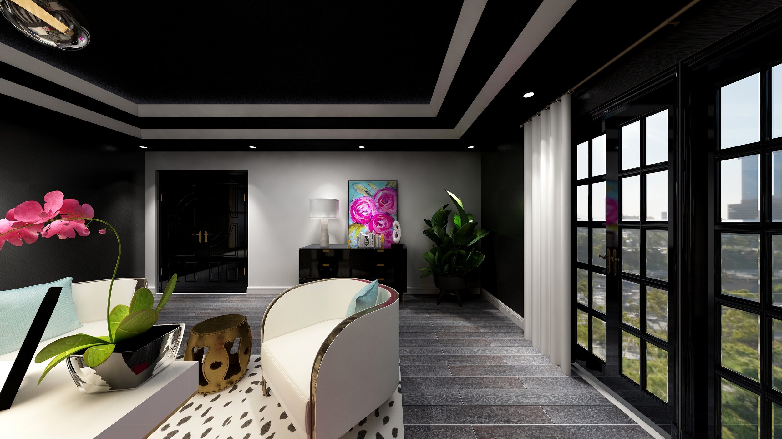
Small Mid-Century Casual Living Room
Although my niche design style is more of a classic, refined and sophisticated nature, I do like to dabble in mid-century modern and Industrial styled designs. They couldn’t be more different, but there is an element to this design that I find so appealing. I love the simple polished look of Classic design, nothing is too fancy or decorative, just simple clean lines and calming touches, much like you might see in some mid-century or minimalist designs.
Many designs, most notably for younger generations have shifted over to very simplistic compositions using neutral colors and simple pieces with soft cozy textures that emulate a comfortable home. People are using their homes and using every room, not like the older generations where you couldn’t put your feet up on the coffee table or the dining room in particular which was off limits until the holidays:) People are actually using their homes to relax in. Go figure!
Another element of mid-century modern design is that many are desiring repurposed and sustainable pieces so that in itself gives such a unique perspective to a design. Pieces are not generally intended to match other pieces perse but more so to contrast and complement.
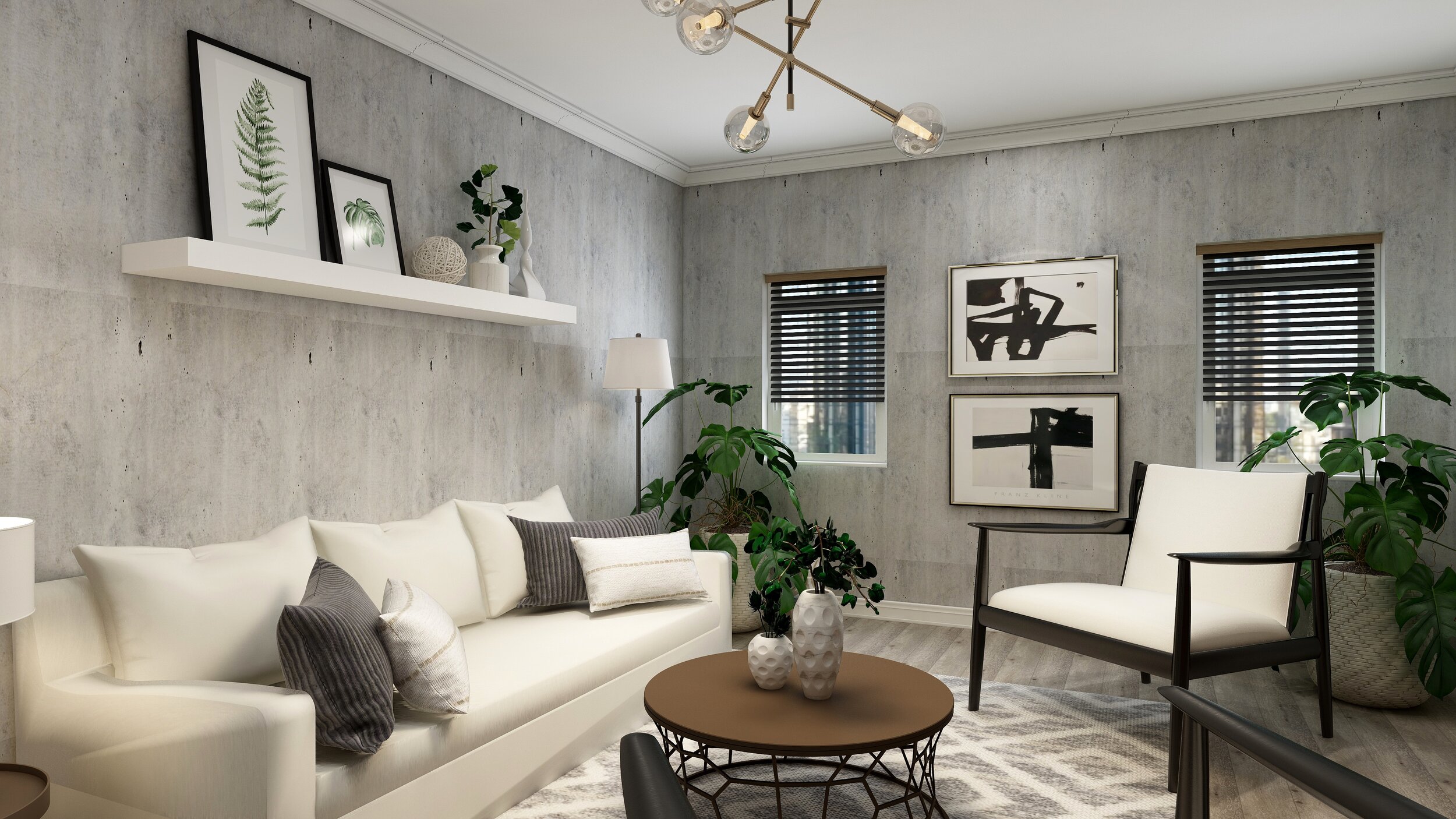
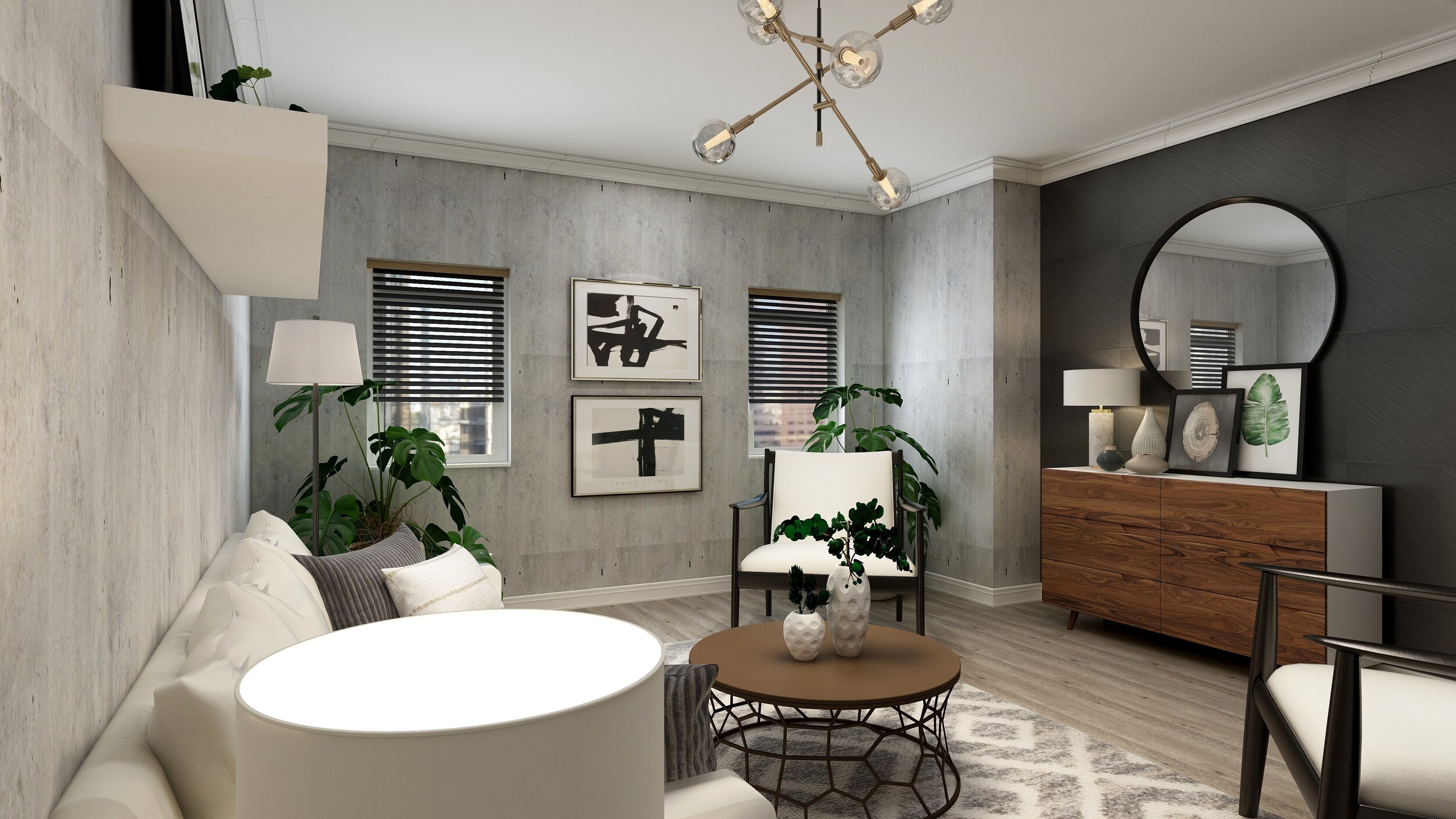
This small Living Room space came with that same premise, simple with a modern casual feel, stylish with a touch of color but with an emphasis on a place to relax without feeling like you were in a model home.
When putting together a Living Room, and are confronted with the term casual and comfortable, the first piece of furniture to consider is usually the style of the sofa, couch or sectional. This is usually the largest piece in the room so once a style is determined, building upon that is key.
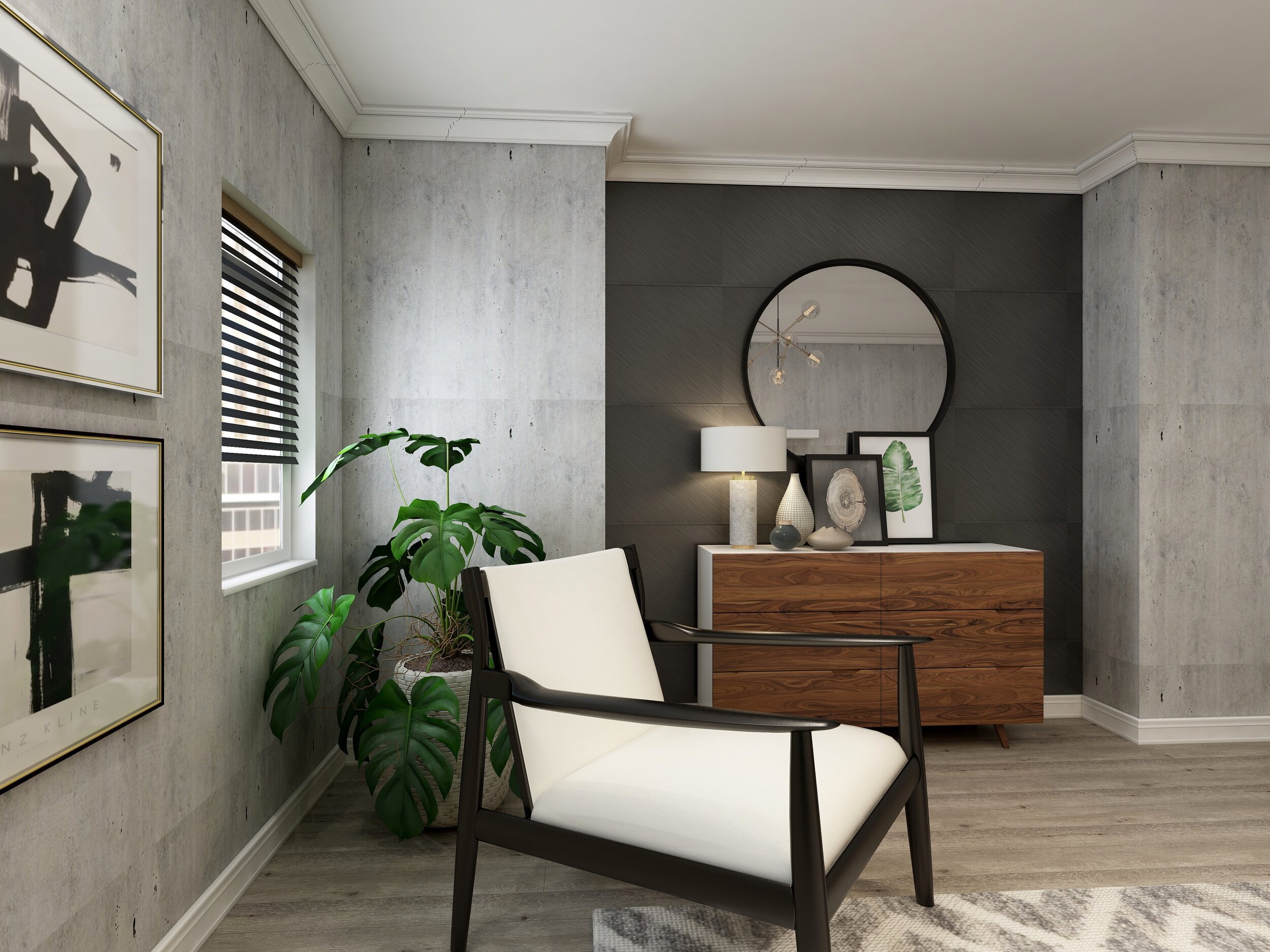
A plush pillow styled sofa was the preferred choice here, where you could envision propping yourself up with cozy decorative pillows and a throw and curling up with a cuppa coffee and good read. Wood tones are a classic featured element of mid-century design and helps further add simple yet natural elements, so bringing in furniture using wood under tones that contrast with other pieces will create an organic and cohesive feel to the space.
Wall paper is always a great alternative when considering wall decor. Painting all walls seems so “yesterday” plus I love the look of using something more decorative and textured on a wall. Adding an accent wall in a different material or effect can be really eye popping, it adds dimension to a space and makes certain pieces pop out. Two effects here, one being an industrial spin using a cement inspired wallpaper and the other using paint over a raised molding to give an architectural effect which in turn helps the sideboard stand out.
Accessories can go a long way in pulling together a mid-century inspired design, black and gold are often times the go to metal choices and work quite harmoniously together. Using these metal elements in pieces such as accent tables, light fixtures or finishing touches is the perfect way to add interest and texture.
Artwork is usually a combination or modern and abstract prints using geometric or curved shapes hung in random gallery style configurations or propped and layered casually above a floating shelf or atop a sideboard.
Finally, bring in some living green, especially if colors tend to be more neutral and monochromatic. Green has such a calming and therapeutic nature, besides studies show that indoor plants can improve concentration and productivity by 15 percent. So a must have indeed!!.
If you like any of the pieces shown in this design, head over to my “Shop the Look Design Boards” for all the details:)
